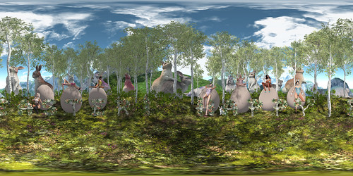
Dim Sum's squints at the big dinner in the distance as her stomach grumbles.
I've been to some sims where it was very easy to find good shots, as though the sim designer had photographers in mind. Some sims were very interesting when you get there, but framing and composing shots were challenging. Zoo World is one of the latter, unfortunately.
I wanted to do one more photo though, because two is not really representative of a place with so many interesting things in it. I was ready to give up and move on, when I realized there was a whale in the water outside the walls of the zoo. And a pretty lighthouse too! (/me loves lighthouses. And whales!)
I couldn't decide between this version with the tail out of the water and another one with the tail underwater.
- This one feels more dynamic somehow. The whale is closer to the viewer, giving a better sense of its largeness. You can't mistake the whale for a rock. The tail's shadow adds to the overall light/dark balance. However, you'd expect the water to be "disturbed" by the tail lifting out of it. At the very least, you'd expect water dripping from the tail. But the picture is supposed to be unprocessed.
- The alternative (see below) feels more peaceful. The whale is more "inside" the picture, but also smaller. The overall picture is lighter. The tail is underwater, so no need to worry about dripping water. However, a small sliver of wave froth is interrupted at the middle left edge and I thought that was distracting.
Which one would you have chosen?
location: Zoo World
Technical notes
windlight: Phototools- Dorm Light 01 (modified)water: Phototools- Ship Light
Depth of Field:
View angle: 7.25
FOV: 35.0
F-number: 12.0
Foc Length: 285
Foc Time: 0.8
CoC: 10.0
Resolution: 1.0
Aspect Ratio: 1.0
Glow Settings:
Quality: 8
Iterations: 10
Strength: 0.2
Luminance: 0.75
Warmth: 5.0
Width: 1.0
Alpha: 0.15
The alternate version:


No comments:
Post a Comment